The world has gone mobile, which is why website owners are adding mobile-friendly sites to their online media collections. However, while designing a great mobile site is easy, ensuring that it works on a number of devices is the tricky part. Luckily, designers don’t have to struggle hard and test their sites on every device in existence. Simply use any or some of these tools to check your website’s readiness for smartphones or tablets.
#1) iPhone Tester
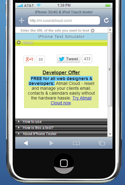
iPhone Tester is ranked #1 for testing websites on iPhones. It is one of the easiest interfaces you’ll use as you only have to enter the website’s URL in the address bar and press enter. One feature that is worth appreciating is the Window button. Through it, you can change the landscape of the iPhone to test your site at different screen dimensions.


#2) Responsinator
For mobile sites developed using responsive design, Responsinator is one of the best tools you’ll find. It allows designers to see how their websites will look on some of the most popular devices. Currently, you will find the following in landscape and portrait forms: iPhone 3, 4 and 5, Crappy Android, Android Nexus 4, iPad, and Kindle.
#3) Screenqueri.es
Another tool to test responsive mobile sites, Screenqueri.es requires signing up to use the free service beforehand. However, the few minutes you spend on the form will be worthwhile since you’ll get to test your website on the simulators of 15 smartphones and 12 tablets from renowned manufacturers like Samsung, Apple and HTC.
Screenqueri.es boasts about offering the most accurate look of your website while allowing you to rotate views like the previous two tools.
#4) MobiReady
MobiReady is one of the true free tools for testing websites on mobile devices. It doesn’t require any of your contact info and its results will instantly be emailed to you along with a numerical rating and a detailed breakdown of your design’s performance in fields like cache information and load speed. This will spare you from future, costly updates and time wastage due to the need to fix your website’s design.
#5) Adobe Edge Inspect
Available through Adobe’s Creative Cloud package, Adobe Edge Inspect is an essential for mobile website developers. Through it, you can pair multiple mobile devices with your iOS and Android devices, grab screenshots, and assess real time results. You can also auto-refresh your devices to check the site’s overall performance.


Once you’re done testing with these tools, always wrap up your project by testing the final design on an actual device. This will ensure that your website is truly ready for the mobile’s smaller virtual world.


